
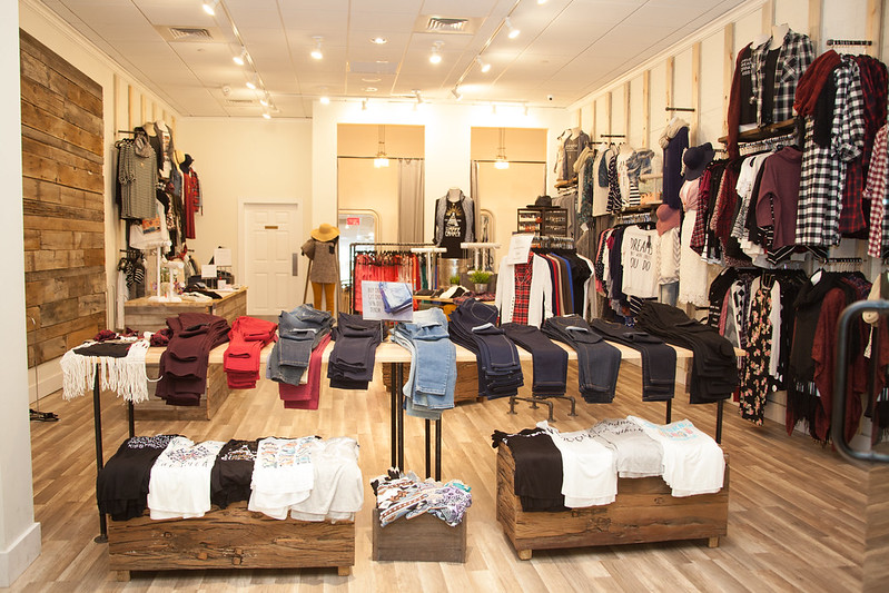
A store’s layout is its silent salesperson. It greets customers, guides their journey, and ultimately influences what they buy and how they feel. A well-planned retail store business layout is not an afterthought; it is a foundational business strategy. It directly impacts traffic flow, product discovery, operational efficiency, and, most critically, your bottom line.
Getting this planning right requires a blend of psychology, design, and logistics. It’s about understanding how customers move and think, then using space, signage, and merchandise to create an intuitive and engaging experience. This guide will walk you through the core principles, popular layout models, and tactical considerations you need to transform your floor plan from a simple arrangement of shelves into a powerful commercial tool.
Understanding the Fundamentals of Store Layout
Before sketching a single aisle, you must grasp the core objectives of effective layout design. The primary goal is to maximize sales per square foot while enhancing the customer experience. This is achieved by controlling the customer’s path through the store, strategically placing merchandise to increase exposure, and minimizing friction for both shoppers and staff.
Customer behavior studies suggest most shoppers naturally turn right upon entering a store. This “right-turn tendency” makes the area to the right of the entrance—often called the decompression zone or transition area—a prime location for high-impact displays. The layout must also account for sightlines, ensuring key departments or promotional areas are visible from the entrance to draw customers deeper into the space. Every design decision, from aisle width to lighting, should be intentional and serve these fundamental commercial and experiential goals.
Choosing Your Core Floor Plan Strategy
There are several established retail floor plan types, each with distinct advantages suited to different merchandise, store sizes, and shopping missions. Selecting the right one is your first major strategic decision.
The Grid Layout
Common in supermarkets, pharmacies, and convenience stores, the grid layout features long, parallel aisles with merchandise on shelves on both sides. This design maximizes product storage in a given space, creates a predictable and efficient shopping trip for customers seeking specific items, and simplifies restocking. However, it can feel utilitarian and may limit browsing or impulse purchases outside the main path.
The Loop (or Racetrack) Layout
This plan creates a defined, circular main aisle that guides customers past every major department in the store. Often seen in department stores and larger specialty retailers, the loop layout exposes shoppers to a curated journey of merchandise. It’s excellent for encouraging discovery and increasing the dwell time of browsers. Strategic placement of anchor departments and promotional Retail Displays at various points along the loop can effectively pull customers through the entire space.
The Free-Flow Layout
Boutiques, high-end apparel stores, and gift shops often use a free-flow layout. It employs asymmetrical arrangements of fixtures, racks, and displays to create an organic, exploratory feel. This approach encourages browsing and creates a sense of discovery, making it ideal for stores where experience and product interaction are key. The downside is it can be less space-efficient and may confuse customers with a specific purchase intent.
The Spine Layout
A variation that combines elements of the loop and free-flow, the spine layout features a single, central main aisle (the spine) with departments branching off to the sides. This offers clear navigation while allowing each department its own distinct character and layout. It works well for medium to large stores with clearly categorized merchandise, such as home goods or sporting goods retailers.
Optimizing Customer Flow and Merchandise Placement
With a floor plan selected, the next layer of planning involves choreographing the customer’s journey. The path you want customers to take is called the “primary path.” Use flooring, lighting, signage, and fixture placement to make this path inviting and obvious.
Place your highest-margin or most promotional items along this primary path and at eye level. Essentials and high-demand items can be placed toward the back of the store to pull traffic through other merchandise zones—a tactic known as the “pull principle.” The checkout area should be clearly visible and accessible, but consider placing high-impulse, low-cost items like candy, magazines, or small accessories nearby to capture last-minute purchases.
Department adjacency is also crucial. Place complementary products near each other to encourage add-on sales. For example, placing shoe polish and laces near footwear, or pasta sauces adjacent to dry pasta, can significantly increase average transaction value.
Selecting and Arranging Fixtures and Displays
Your fixtures are the furniture of your store. They hold your products and define your space. The choice between slatwall, gridwall, shelving units, tables, and Store Fixtures should align with your brand aesthetic and product needs. A mix of fixture types (e.g., tables for folding, racks for hanging, shelves for stacking) creates visual interest and accommodates different merchandise forms.
Follow the “A-B-C” vertical merchandising principle: Place best-sellers and high-margin items at eye level (Zone B). Reserve the top shelf (Zone A) for premium items or brand imagery, and use lower shelves (Zone C) for bulkier items, sale goods, or products targeted at children. Endcaps—the displays at the end of aisles—are some of the most valuable real estate in a store and should be used for new products, promotions, or seasonal items.
Integrating Lighting, Signage, and Sensory Elements
The ambiance of your store is shaped by elements beyond the floor plan. Lighting is a critical sales tool. Ensure general ambient lighting is bright enough for comfort but use focused accent lighting to highlight feature displays or high-value products. Natural light, where available, can create an appealing atmosphere.
Signage must be clear, consistent, and helpful. Wayfinding signs (e.g., “Men’s Apparel,” “Checkout”) should be placed high for visibility. Informational and promotional signs should be concise and benefit-oriented. Don’t underestimate the power of sensory marketing: a pleasant, subtle scent or a carefully curated music playlist at an appropriate volume can enhance dwell time and brand perception, making the space feel more cohesive and intentional.
Planning for Operations and Flexibility
A beautiful layout that hinders your staff is a flawed layout. Ensure your plan accommodates efficient operations. Aisles must be wide enough for restocking carts and for multiple customers to pass comfortably. Stockrooms and employee break areas should be accessible without disrupting the customer experience. The checkout area needs space for queues and bagging.
Furthermore, build in flexibility. Consumer trends and inventory change. Use modular fixtures that can be reconfigured and plan for seasonal or temporary display areas. A flexible layout allows you to refresh the store’s look, test new merchandise arrangements, and adapt to changing needs without a full redesign.
Frequently Asked Questions
What is the most important factor in retail store layout?
Customer experience is the paramount factor. Every element—from the floor plan to fixture height—should be designed to make shopping intuitive, enjoyable, and efficient. A positive experience increases dwell time, fosters loyalty, and directly drives sales. The layout is the physical framework of that experience.
How wide should retail store aisles be?
Aisle width depends on your store type and customer traffic. A standard minimum for a self-service store is 3 to 4 feet to allow one cart to pass. Main aisles or those in higher-traffic areas should be 5 to 8 feet wide. For wheelchair accessibility, a clear width of at least 36 inches is recommended.
How often should I change my store’s layout?
A full layout overhaul is rare, but you should refresh merchandise placement and focal displays frequently. Consider minor changes monthly to highlight new products and major seasonal resets 4-6 times per year. Constant small changes keep the store feeling fresh and encourage regular customers to explore.
What is a decompression zone?
The decompression zone is the area (typically 5 to 15 feet) inside the store entrance where customers adjust from the outside world, slow their pace, and orient themselves. Avoid placing critical merchandise or checkout counters here. Use it for impactful visual displays that set the store’s tone and draw the eye inward.
How can a good layout reduce shoplifting?
A strategic layout aids loss prevention by maximizing visibility. Use lower fixtures (under 4 feet) in key areas to eliminate blind spots for staff. Ensure checkout areas have clear sightlines down aisles. A clean, organized, and well-lit store with a logical flow also subtly discourages theft by increasing the perceived risk of being observed.
Should online and offline store layouts be similar?
While the mediums differ, the principles of navigation and discovery should align. Group products into intuitive categories online just as you would in-store. Use prominent placement for bestsellers and promotions. A cohesive strategy across channels reinforces your brand and creates a familiar, trustworthy experience for omnichannel shoppers.
Conclusion
Planning your retail store business layout is a complex but rewarding exercise in strategic design. It moves beyond mere aesthetics to become a dynamic tool for driving sales, shaping customer behavior, and expressing your brand’s identity. By starting with a clear understanding of your goals, selecting an appropriate floor plan, and meticulously applying principles of flow, merchandising, and ambiance, you create a space that works as hard as your team does.
Remember, the most effective layouts are those that remain fluid. Customer preferences evolve, new products arrive, and seasons change. View your floor plan not as a permanent blueprint, but as a living system. Regularly analyze sales data, observe customer behavior, and be willing to adapt. A thoughtfully planned and actively managed store layout is one of the most sustainable competitive advantages a brick-and-mortar retailer can possess.










Most Commented